Small interactions, big smiles: making users love your interface
Ever wondered why TikTok is so addictive? Everything's in the tiny details! Discover how smart microinteractions transform good apps into can't-put-down experiences users love.
Why microinteractions matter: the psychology of user happiness
Microinteractions are those tiny events in our apps that, when used wisely, create moments of user engagement and reward users for their actions. They are small design elements meant to be welcoming and memorable, ensuring users remember them and subconsciously keep coming back to your app.
Microinteractions are meant to fulfill these main functions:
Instant feedback
Respond immediately to user actions, making interactions feel smooth and natural. Like that satisfying ripple when tapping a button, or the gentle bounce at the end of a scrolling list.
Direct control
Give users a sense of physical manipulation in digital interfaces. Like dragging and dropping files with a gentle animation, or the way toggle switches smoothly slide between states.
Visual cues
Highlight interactive elements through subtle animations and state changes. Buttons that gently pulse, links that smoothly underline on hover - these tiny signals guide users naturally.
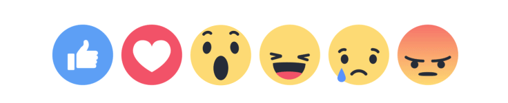
Emotional design
Create delightful moments through positive feedback animations. Those little heart explosions on likes or success confetti celebrations make digital interactions feel rewarding and human.
User engagement
Keep users coming back with satisfying micro-rewards throughout their journey. Small, pleasing interactions add up to create an interface that users genuinely enjoy using.
Human touch
Make digital interfaces feel less robotic through natural, fluid movements. Subtle transitions and organic animations help create a more comfortable, human-centered experience.
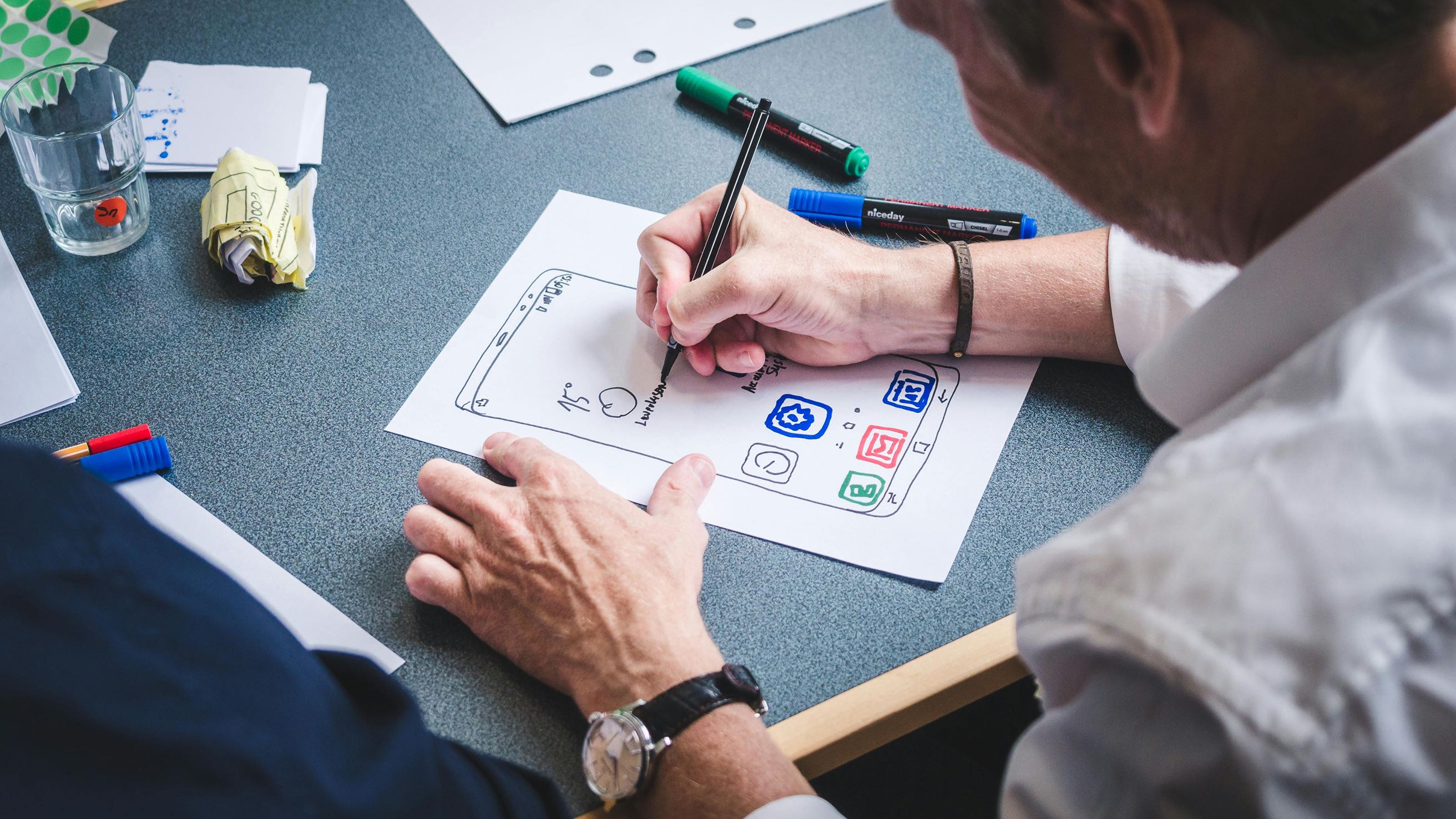
The pillars of perfect microinteractions
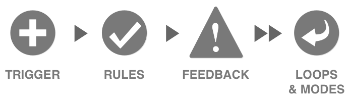
As stated by Dan Saffer, the author of the book Microinteractions, there are four main parts of microinteractions.
Trigger: what gets things started
The trigger is what initiates an interaction. They can be user-initiated or system initiated.
User triggers
Interactions that respond to user gestures. Every tap, swipe, or pull triggers a specific response - putting users in control of their experience.
System triggers
Automatic responses when specific conditions are met. Like notifications appearing when you enter a location, or achievement badges popping up when you hit a milestone.
A good example of a system initiated trigger is that blue button that floats over X (saying that there are new tweets that you haven't read) when you come back after some time (that's the qualification that needs to be met). It triggers you to click on it and takes you back to the top of your feed.
Rules: making it make sense
Rules determine what happens after a microinteraction triggers. They should feel natural and help prevent user errors. Gmail's "forgotten attachment" reminder is a perfect example – when you write "I've attached" but haven't actually attached anything, Gmail's got your back with a friendly reminder.
Feedback: keeping users in the loop
Feedback eliminates guesswork. Consider that satisfying green checkmark when checking username availability during registration. It's way better than completing an entire form only to discover your chosen username is taken (and having to retype everything... ugh).
The loops & modes: adapting to change
Loops and modes are the answer to a "What happens to a microinteraction when conditions change?" question.
Microinteractions in action
Swipe gestures for navigation
Swiping is intuitive and reminds users of physically moving elements on the screen, reducing the need for thinking and enhancing the user experience.
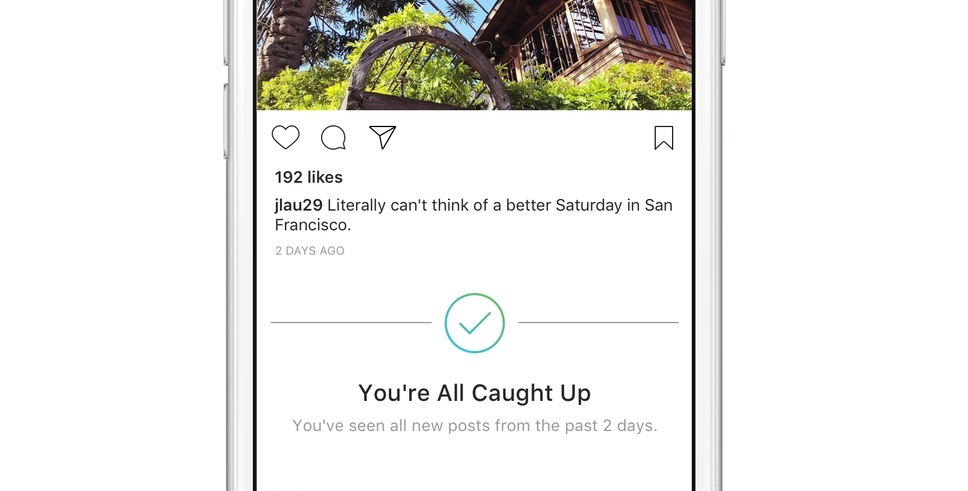
Keeping users informed
Don't let your user get bored. Keep them informed and (at least visually) engaged. Take a look at Instagram and their "You're all caught up" banner. It's truly brilliant – it prevents endless scrolling through old content, showing users that Instagram values their time.
User rewards
Reward your users for their actions. Facebook's Text Delights are perfect examples of rewarding user actions.They are animations that trigger when you type specific phrases in the comment section. For example, try typing "you're the best" or "wonderful time".
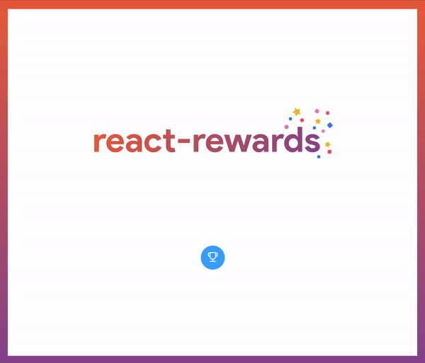
For React developers, there's react-rewards – a library I created that lets you shower your users with confetti or emoji celebrations!
The "why should I care?" part - the emotional impact
Imagine you're at a bar and use your best pick-up line on someone amazing. They let you sit with them but show zero emotion – no smile, no feedback, nothing. Sure, you achieved your goal, but something crucial is missing: emotional feedback.
It's like the difference between a perfect 10 who's emotionally distant and a 9 who makes you feel fantastic. The same applies to software UX design – users will choose an app that feels more human over one that's technically perfect but emotionally cold. Well-designed microinteractions show users you care, encouraging them to return.
The "I don't have money!" part
In the IT industry, you might hear "we don't have money for that" often. But even with a small budget, you can leverage the Halo Effect.
Halo Effect – use it wisely and users will be yours
The Halo Effect is a cognitive bias, where a positive or negative impression of one aspect influences the perception of the whole. It is often based on the first impression. A simple example is when someone sees a person in a photograph who looks attractive, well-groomed, and well-dressed, and then assumes that this person must also have a great personality.
Again, the same applies to software. Users will judge an app based on first impressions and interactions. Invest in well-designed microinteractions in key areas like onboarding to create a great first impression.
React-Rewards: easy user rewards on a budget
If you're on a budget, use React-rewards, a small library I created. It lets you wrap buttons with a confetti or emoji cannon in a few lines of code, rewarding users for actions like account registration or donations. These tiny details make a big impact. Visit my GitHub page to learn more!
Ready to enhance your app with engaging microinteractions? Check out how our Product Design experts can help you create an unforgettable user experience!